
On the second of March 2019 (Saturday), I visited the Sabanci Museum in Istanbul with two of my classmates. More specifically, we visited the exhibition “Russian Avant-Garde. Dreaming the Future through Art and Design”, a temporary exhibition that I had the wonderful chance to enjoy. My interest in the Russian avant-garde movement began during my first year at university, and throughout my studies I have encountered topics on Russian avant-garde quite a few times, especially on Malevich and Kandinsky. However, I have not had the chance to see their artworks in real life up until my visit to the Sabanci Museum, so this exhibition was a special and personal experience for me. I was eager to go to the exhibition, and I did not leave disappointed. I must point out, however, that the presence of the artworks themselves was enough for my satisfaction and it had little to do with how I felt about the exhibition as a whole. In this paper I will aim do an objective critique of the exhibition and I will discuss whether I think it was a successful one or not.
I will start with the entrance to the exhibition. I believe it is a rather confusing one, it took us some time to find the entrance to the avant-garde exhibition, since there are other, temporary exhibitions at the museum as well. I must admit that this might have been our fault, as most people did not seem to have been confused and/or lost. In the last section of the exhibition (which we thought was the first) there was a strikingly lengthy text, taking up the place of an entire wall (Figure 1). I usually do not mind long texts in museums, and I enjoy reading them, but I found this text problematic due to its content. The text was titled “Forced Modernization and Dictatorship” and was overly-politicized in my opinion. It was a short critique of the Communist regime in the USSR, and I believe such texts do not have place in an art exhibition. This text is simply the political opinion of the curators and/or of the institution, and it provides a one-sided and biased perspective on the matter. I will not go on and criticize the text itself, but rather the irrelevance of it. We can categorize the museum visitors in two sections – those familiar with the USSR and those who are not. The former would not want to read such a text because they are already familiar with the matter and would not want to waste their time reading something they know. The latter, I believe, would also not be interested in the text, since an art exhibition is not a place for history and politics studies. They might want to read about the USSR and about communism after the exhibition but reading the text while at the museum would only distract them from the artworks which are the centre of the exhibition. In my opinion, nobody is interested in the curators’ political stands and their knowledge on world history. As for the lighting – it was too dim and the lightbulbs were directed towards the artworks in an unpleasant way, making them hard to see. The arrangement of the paintings, however, was pleasant and in touch with the context of the exhibition – it was sterile and minimalistic. This leg of the exhibition had more of a “baby bird” approach, which I enjoy, but I do not think the large part of the museum goers would appreciate such an approach, since to most people Russian avant-garde might seem “boring”, and they would expect that the curators would compensate for that by creating a more interactive exhibitions. However, the curators decided to embrace the idea of the Russian avant-garde, and I personally liked this.
On the wall by the staircase leading to the next (or previous) instalment of the exhibition, there were photo portraits of the most notable people from the Russian avant-garde movement, along with some information and facts about their life and art. I think it was a nice feature, considering that most people would want to know what the artists looked like and what were they like as persons. In the next hall, there were some paintings as well as some sculptures by the Russian artists, like Rodchenko, Kliun, Popova, and Klucis. I was fascinated by the artworks and their arrangement. The colour themes of the exhibition rooms – black and red – were also satisfying. There were documents exhibited as well, written by the likes of Tatlin and Kandinsky. However, there were no translations presented. As a Bulgarian, I found it rather easy to read and translate the content of those documents, but I believe the local visitor would not be familiar with Slavic languages and would wonder what the documents were about. If I was in a similar situation, I would be rather irritated. Given the fact that those documents are relatively short, I do not see an obstacle for the presentation of translated versions. On the walls there were texts discussing the movement, its origins, intentions and so on. The texts were informative and interesting, but some people might consider them too long. The vocabulary was too pretentious on occasions and possibly was out of reach for most of the visitors. Given that the art movement itself is abstract, complex and not what most of the people imagine when they hear “art”, I think the pretentiousness of the labels is justified to some extent. I must admit there was a feel that the curators expected the visitor to be familiar with the theory and history of art, and that they did not aim for the comfort the unfamiliar visitor. There was a film about Tatlin’s Tower being projected onto one of the walls, and I found it interesting, and other people were watching it as well. There were two or three more films in the exhibition, one of them being the play “The Magnificent Cuckold” from 1922, directed by Vsevolod Meyerhold. The film shows the visitor that the Russian avant-garde movement did not have an impact only on pictorial art, but it affected other aspects of culture, such as opera and theatre. In that hall there was also a mini-exhibition of Analytic Art – a tribute to Pavel Filonov along with a text describing the style and the artistic intentions of Filonov. Next to that hall there was another which was dedicated mainly to sculpture, representing the three-dimensional aspect of the movement, and the constructivism in its purest sense. I was disappointed that there was not a model for Tatlin’s Tower, given that it is one of the most notable three-dimensional concepts attributed to the avant-garde movement in Russia.
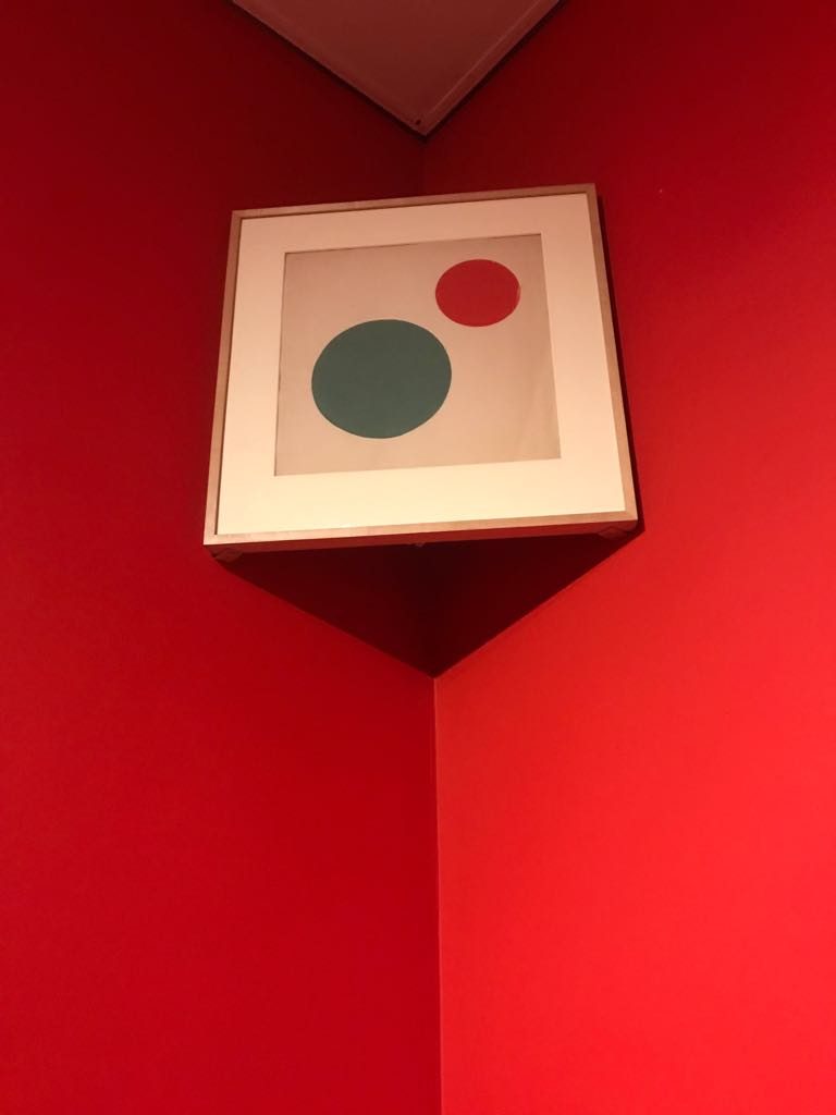
When we got to the last part of the exhibition (that was originally intended to be the first), I finally got to see Malevich in real life. I was overwhelmed by the fact that I am in the same room with artworks by Malevich, and at first, I could not notice the large amount of people in that hall. As we were going from the last to the first hall, the number of people was increasing. In this first hall, there were mothers with children, there were students, there were families and so on. It was a bit chaotic – parents looking after their children, students taking pictures in front of the paintings (instead of taking pictures OF the paintings), people talking loud etc. There was definitely interest for the exhibition, but I did not see a lot of people looking at or taking pictures of the Malevich paintings. I believe that most people did not know who he is, but this does not mean that people did not appreciate the exhibition. I just think that the curators hoped that the visitors would know at least the bigger names. There were Malevich paintings from his early “pictorial” period to his late purely geometric period (Black Rectangle, 1915.) One of the most successful and admirable, yet sort of expectable features of the exhibition in the hall was the arrangement of the paintings, specifically the ones put on the corners (Figure 2). The curators did what Malevich did in the 0,10 Exhibiton – they hung artworks in the corner of the room, which I found as a successful tribute to Malevich and the other artists from the movement. However, it was rather strange that the artworks in the corner were not by Malevich. Nevertheless, the 0,10 exhibition was not about Malevich alone anyway, so I do not think of that as a mistake. Moreover, at the Sabanci exhibition there were no Malevich paintings big enough to be hung in the corner, so it is understandable.
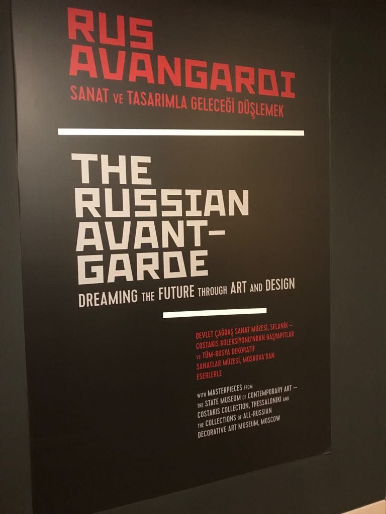
The exhibition was not an interactive one – it was a one-way conversation “designed around the cognitive order in the minds of the curators”[1], and I doubt children would enjoy it as they would enjoy a natural history exhibition, for example. It was solely focused on art and culture. Personally, this is what I wanted – it was informative, it was rich on artworks, and it embraced the concept of the artistic movement. I found interesting that documents exhibited alongside artworks, within the museum context, become as valuable and artistic as the artworks themselves. I also liked the banner which was advertising the exhibition (Figure 3) – it uses the colours which were used in the exhibition itself, the font is good, it is bilingual, and it resembles a suprematist artwork. I have two suggestions for improvement. One is regarding the hall I talked about at first – it would be nice if the lighting was changed with neon lights or large ceiling lamps instead of lightbulbs directed at the artworks. I would also remove the lengthy politicized text. Second, I would include something interactive – an interactive sculpture, or a do-it-yourself type of sculpture where people have geometric figures which they use for various constructions. Overall, I believe the exhibition was successful, and it aimed to be a pure Russian avant-garde exhibition. The curators, however, did not seem concerned with the visitors, but the content itself does not “care” about them either.
Bibliography:
American Association of Museums. “Standards for Museum Exhibitions and Indicators of Excellence”
Beverly, Serrell, “Ten Deadly Sins”. Exhibit Labels: An Interpretive Approach, 2015
Beverly, Serell. “Who is the Audience (and What Do They Want)?”. Exhibit Labels: An Interpretive Approach. Rowman Altamira, 1996. pp. 37-49
Edson, Gary, and David Dean. “Museum exhibitions.” The Handbook for Museums. Routledge, 1994. pp. 145-159
McLean, Kathleen. “Museum Exhibitions and the Dynamics of Dialogue.” Daedalus, vol. 128, no. 3, 1999, pp. 83-107
[1] McLean, Kathleen. “Museum Exhibitions and the Dynamics of Dialogue.” Daedalus, vol. 128, no. 3, 1999, pp. 89
Figure 1:

Figure 2:
Figure 3:
списание „Нова социална поезия“, бр. 19, ноември, 2019, ISSN 2603-543X